How to use the Figma community library file to design digital services
24/08/23 | Blog
By Constantinos Evangelou, Interaction designer
At the Digital Services Factory (DSF) we believe that sharing our work can benefit other teams developing digital services for the government and ultimately improve the digital experience of citizens with the government. We have therefore created and published a Figma community library file based on the library we use in our team internally to design our services. In this article, we will demonstrate how you can use our published file within your service delivery team.
The Figma library has been created to rapidly create designs and prototypes the gov.cy way. However, it is not intended to be used as a source of guidance or documentation on how to use its design elements. Please visit the gov.cy Design System for that.
Our library is built within Figma’s ecosystem and its functionality is subject to any changes made by Figma. The instructions below were tested and validated when this post was drafted, but we suggest you consult Figam’s help centre for more accurate instructions.
Prerequisites
You will need to have a Figma account. The library can be used both by free and paid accounts.
Get your copy
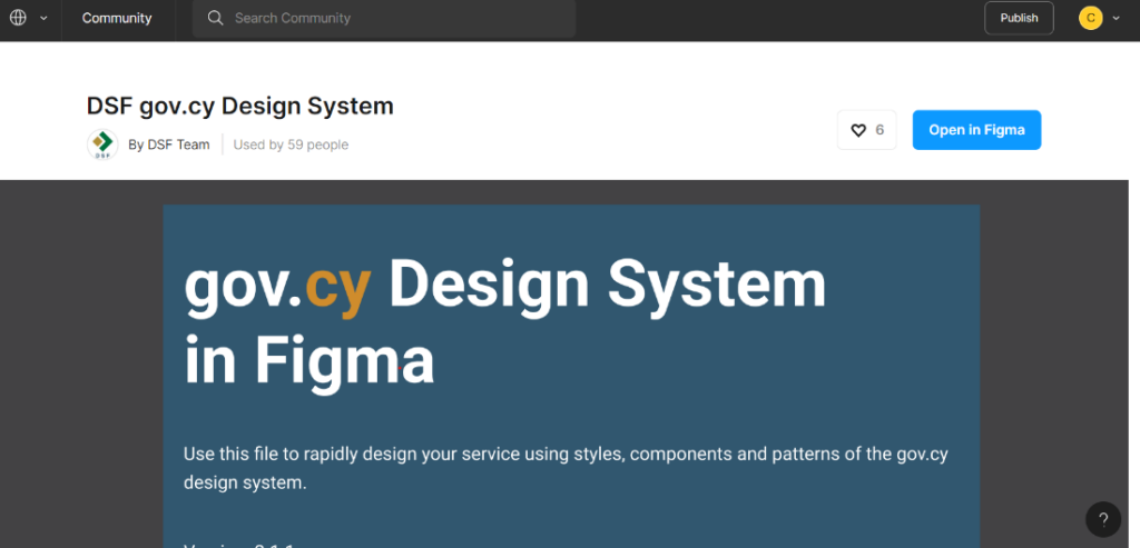
Get a copy of the library for your team by visiting our Figma community file page and clicking the “Open in Figma” button. A copy of the file will be added to your Figma account’s “drafts” area. For more details on how to do this, check out the duplicating community files page in Figma’s documentation.
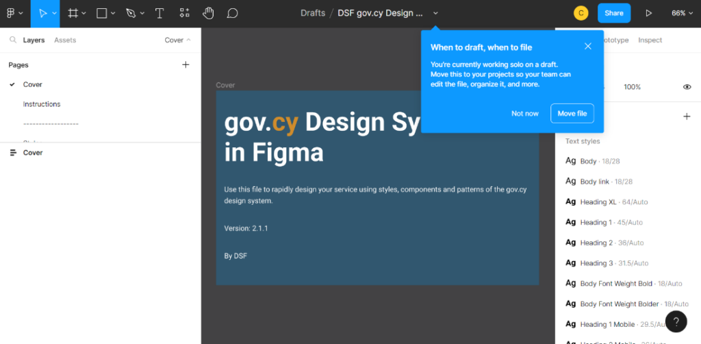
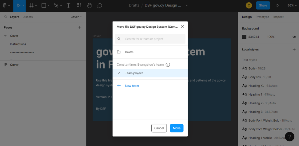
Move the file and publish it to your team
To use the file as a library, you will need to move the file from your “drafts” into your Team’s area, publish the file as a library in your team and use the styles and components in your team’s design files.
To publish the components of the library in your team, you need a paid subscription with Figma. For more details on how to do this, check out the Figma documentation page for publishing styles and components.
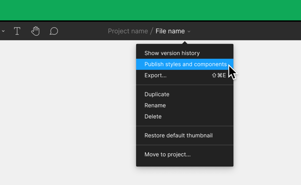
If you don’t have a paid subscription with Figma, you can still publish the library in your team, but this will publish only the styles and not the components. Still, you can use the components of the library by simply copying component variants from the library file to your team’s design files. For more details on how to add component instances from a library, check out this Figma documentation page.
Start with a page component
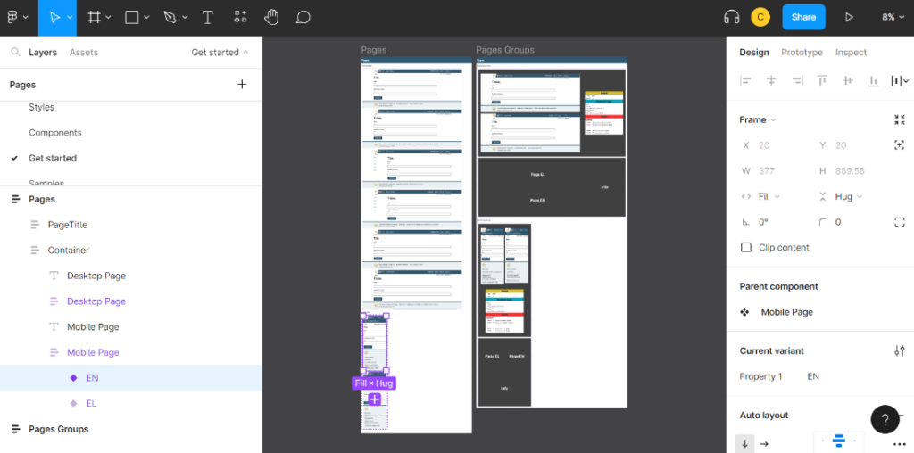
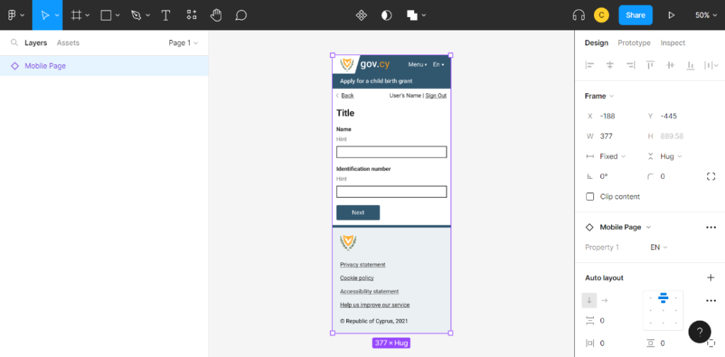
To create a design for a page, start with a new instance of a “Page” or a “Page group” component. You can find both desktop and mobile page components on the “Get Started” page.
Add and remove component instances
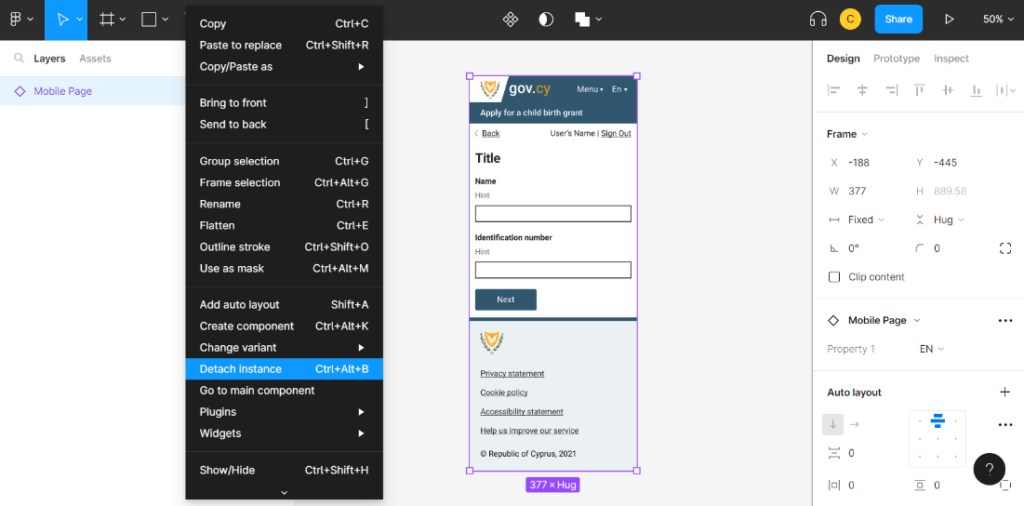
To make changes to page component instances, first detach the instance. You can then remove any components that are not needed from the pre-built page and add instances of the desired components.
Make sure to create the component instances in the appropriate area. For example, the “User data” component must be created inside the “Before-main-section” of the page, as defined in the design system documentation.
To make changes to component instances created from the library in your team’s design file, remember to first detach the instances.
Use text and colour styles
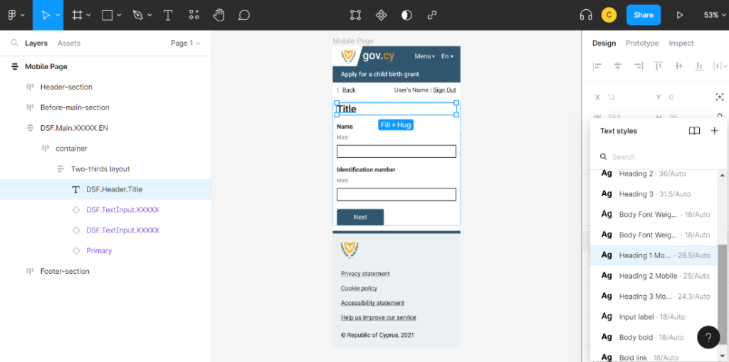
When making changes on component instances, make sure you use the pre-defined colour and text styles. For example, an <h2> should have a “Heading 2” (or “Heading 2 Mobile” if you are designing a mobile page) text style and a “Heading” colour style.
Variants
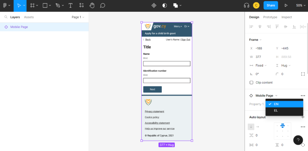
Most of the components of the library have different variants. For example, the component “Mobile page” has a Greek (“EL”) and an English (“EN”) variant, or the “Text input” has a “Default”, “Error”, “20 Characters”, “10 Characters” variants and so on.
Relevant Content
- How User Research drives success in digital Government services
- Enhancing the Unified Design System with automated visual testing
- Design System update (V.3.0.0) - Unified Design System
- Improving Accessibility: Lessons from making design elements screen reader-friendly
- Framework for the Digital Transformation of Government Services