Improving Accessibility: Lessons from making design elements screen reader-friendly
23/01/24 | Blog
By Constantinos Evangelou, Interaction designer
Creating new design elements presents a challenge, as we must make sure they can be used by everyone. In our latest service, we introduced new components and patterns and tried to make them as usable and accessible as possible, with special focus on making them screen reader-friendly. In this article we present the way we tried to evolve the screen reader capabilities of our components and share the lessons we have learned from that process.
Background information
Before we start, let us share an overview of what this service is about. We were tasked to create a service for individuals that were affected by the 2013 bail-in. These users would submit the details of the haircut their funds got, in order to be considered when preparing the National Solidarity Fund Replenishment Scheme.
Due to the complexity of the details, and the fact that all the details needed might not be immediately available, we incorporated some features to assist the users complete the service with ease and efficiency. We introduced features like the ability to ask for multiple items of the same type, details to be automatically saved in a temporary state and the ability to complete the submission in an asynchronous way.
We therefore had to create design elements to accommodate these features such as the “Task List” and “Multiple things” patterns.
To offer the same experience with screen readers we tested the implementation with NVDA and Mac’s VoiceOver.
Task list

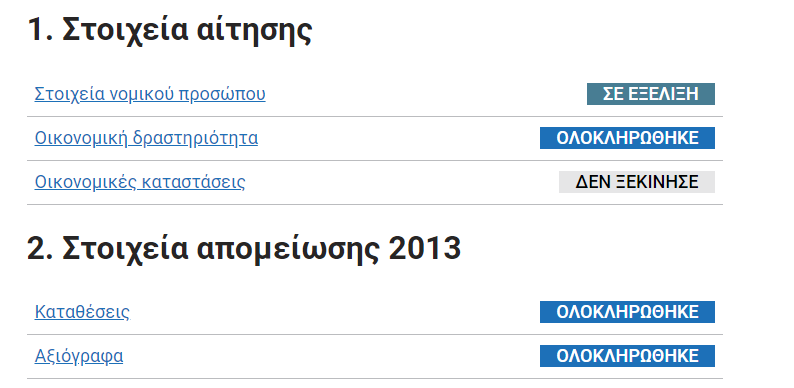
The Task list was designed to help users understand the tasks involved in completing the service and their status. The design is simple, a table with rows representing different sections of the service. Each row contains cells with links leading to the respective section and a colorful tag describing its status.
This design proved very helpful during our user research sessions. Users stated that the task list guided them through the complex service and helped them understand what they needed to complete when they re-visited the service at a later stage. It also allowed them to complete the service in a non-linear manner.
Problem: Reading the section and status
During our screen reader trials, we noticed that when navigating through the page using the tab key, the status of the section was not read.
The problem with the aria-describedby approach
In our first try we used the aria-describedby attribute on the anchor item, linking to the respective status. We believed this would provide an easy to implement solution that would enable screen readers to read both the anchor and the status content.
Here is a code segment of the aria-describedby implementation:
<table class="govcy-table">
	<tbody>
	  <tr>
		<td>
			<a id="LegalDetails" href="#1" aria-describedby="desc-1">Στοιχεία νομικού προσώπου</a>
		</td>
		<td class='govcy-text-end'>
			<span id="desc-1" class='govcy-tag govcy-bg-info ay govcy-text-white govcy-fw-bold govcy-px-3'>ΣΕ ΕΞΕΛΙΞΗ</span>
		</td>
	  </tr>

	  ...

	</tbody>
</table>
When we tested the Greek variant with NVDA on Windows, we noticed that even though the anchor content was read correctly, the status content that was linked by the aria-describedby attribute was spelt in a letter-by-letter manner instead of being read as whole words. For example, ”ΣΕ ΕΞΕΛΙΞΗ” was read as ”Sigma Epsilon Epsilon Zai Epsilon Lamta Ai Zai Eta”.
This is how NVDA read the link:
Our investigation showed that this could be corrected by setting the Windows regional format to Greek. When we tried it though, we were not able to correct the issue.
This posed a problem as we wanted to find a solution that is tested and would serve everyone, without having users changing their preferred regional format settings.
Solution with the govcy-visually-hidden-error class
In our second try, we implemented a solution utilizing the special govcy-visually-hidden-error class that we already used in our error message component and is available in our CSS. This class hides the content visually from the screen and print media types but is read by screen readers.
Here is a code segment of the govcy-visually-hidden-error implementation:
<table class="govcy-table">
	<tbody>
	  <tr>
		<td>
			<a id="LegalDetails" href="#1">
			  <span class="govcy-visually-hidden-error">Ενότητα: </span>
			  Στοιχεία νομικού προσώπου
			  <span class="govcy-visually-hidden-error"> με κατάσταση ΣΕ ΕΞΕΛΙΞΗ</span>
			</a>
		</td>
		<td class='govcy-text-end'>
			<span class='govcy-tag govcy-bg-info ay govcy-text-white govcy-fw-bold govcy-px-3'>ΣΕ ΕΞΕΛΙΞΗ</span>
		</td>
	  </tr>

	  ...

	</tbody>
</table>
This is how NVDA read the link:
We tested this with multiple screen readers, in both Greek and English variations and it played as expected.
Multiple things on check your answer page

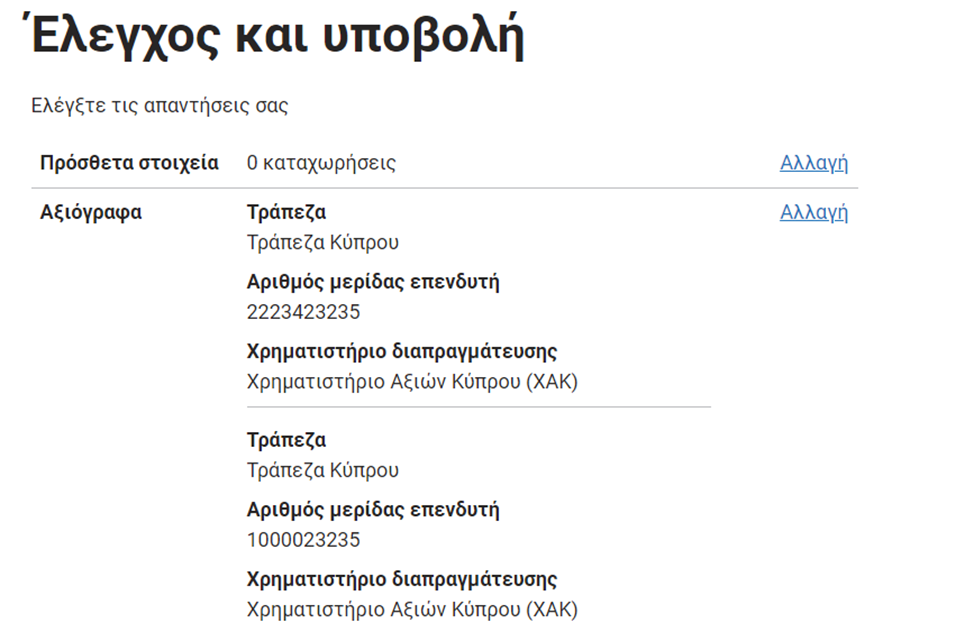
In our initial implementation of the service, we displayed only a count of how many items the users entered for sections that used the add multiple things pattern on the check your answers page. However, during our user research and pilot sessions, it became apparent that one of the most requested features was the inclusion of the data entered on the check your answers page.
Therefore, we developed a pattern to present the details of all entered items, mirroring the format used to display detailed results in the existing pattern. Each record is now separated by a horizontal line for improved clarity.
Problem: individual records were not distinguishable
During our trials we noticed that when navigating through the page using the down arrow key, the content of the whole section was read as one block and there was no way to distinguish when an individual record started or ended.
Here is a code segment of the initial implementation:
<tr>
	<th scope="row" class="col-3">Αξιόγραφα</th>
	<td class="col-7">
		<p>
			<span class="govcy-fw-bold"><strong>Τράπεζα</strong></span>
				<span class="govcy-d-block">Τράπεζα Κύπρου</span>
		</p>
		<p>
			<span class="govcy-fw-bold"><strong>Αριθμός μερίδας επενδυτή</strong></span>
			<span class="govcy-d-block">2223423235</span>
		</p>
		<p>
			<span class="govcy-fw-bold"><strong>Χρηματιστήριο διαπραγμάτευσης</strong></span>
			<span class="govcy-d-block">Χρηματιστήριο Αξιών Κύπρου (ΧΑΚ)</span>
		</p>
		<p class="govcy-br-1 govcy-br-top-0 govcy-br-standard"></p>
		<p>
			<span class="govcy-fw-bold"><strong>Τράπεζα</strong></span>
			<span class="govcy-d-block">Τράπεζα Κύπρου</span>
		</p>
		<p>
			<span class="govcy-fw-bold"><strong>Αριθμός μερίδας επενδυτή</strong></span>
			<span class="govcy-d-block">1000023235</span>
		</p>
		<p>
			<span class="govcy-fw-bold"><strong>Χρηματιστήριο διαπραγμάτευσης</strong></span>
			<span class="govcy-d-block">Χρηματιστήριο Αξιών Κύπρου (ΧΑΚ)</span>
		</p>
	</td>
	<td class="col-2  govcy-text-sm-start govcy-text-md-end">
		<a href="/securities-review/true">Αλλαγή<span class="govcy-visually-hidden-error">Αξιόγραφα</span></a>
	</td>
</tr>
This is how NVDA read the area:
While visually, the two records were distinguished through the horizontal line, screen readers treated the entire <tr> section as a single block and read it all at once.
Solution with description list <dl> and govcy-visually-hidden-error class
We implemented a solution using a combination of description lists and the govcy-visually-hidden-error special class once again.
Here is a code segment of the solution:
<tr>
	<th scope="row" class="col-3">Αξιόγραφα <span class="govcy-visually-hidden-error"> 2 καταχωρήσεις</span></th>
	<td class="col-7">
		<dl>
			<dt><span class="govcy-visually-hidden-error">Καταχώρηση 1</span></dt>
			<dt>Τράπεζα</dt>
			<dd>Τράπεζα Κύπρου</dd>
			<dt>Αριθμός μερίδας επενδυτή</dt>
			<dd>2223423235</dd>
			<dt>Χρηματιστήριο διαπραγμάτευσης</dt>
			<dd>Χρηματιστήριο Αξιών Κύπρου (ΧΑΚ)</dd>
		</dl>
		<dl>
			<dt><span class="govcy-visually-hidden-error">Καταχώρηση 2</span></dt>
			<dt>Τράπεζα</dt>
			<dd>Τράπεζα Κύπρου</dd>
			<dt>Αριθμός μερίδας επενδυτή</dt>
			<dd>1000023235</dd>
			<dt>Χρηματιστήριο διαπραγμάτευσης</dt>
			<dd>Χρηματιστήριο Αξιών Κύπρου (ΧΑΚ)</dd>
		</dl>
	</td>
	<td class="col-2  govcy-text-sm-start govcy-text-md-end">
			<a href="/securities-review/true">Αλλαγή<span class="govcy-visually-hidden-error">Αξιόγραφα</span></a>
	</td>
</tr>
This is how it is read by NVDA using the down arrow key:
By using description lists, navigating through the records has become more controlled and natural and by using the <dt><span class="govcy-visually-hidden-error">Καταχώρηση 2</span></dt> we were able to make records distinguishable. As a bonus, we used <span class="govcy-visually-hidden-error"> 2 καταχωρήσεις</span> in the row heading to inform the users that they should anticipate 2 records.
Although this isn’t directly related to making the design element screen reader friendly, we also implemented the following styling overwrites to ensure that the description lists’ style remains consistent with the check-your-answers pattern:
	dt {
			font-weight: 700;
		}
	.govcy-table dl {
			border-bottom: 1px solid #bbbcbf;
		}
	.govcy-table dl:last-child {
			border-bottom: 0px;
		}
Conclusion and lessons learned
When we started as a team two years ago, making services screen reader-friendly posed somewhat of a mystery to us. As we work on more services along the way, we are gaining the confidence and the experience to make our products more accessible and inclusive.
Summarizing, here are some of the lessons we’ve learned while implementing these two design elements:
- screen readers may behave differently given the same set of HTML code
- make sure you test all language variants of your service with different screen readers
- even if you use the correct language in the
<html>tag (for example<html lang="el">), Greek words that are not directly part of the HTML<body>might be read in a letter-by-letter manner. govcy-visually-hidden-errorclass approach is a more reliable approach than usingaria-describedby- description lists are ideal for listing key-value pairs
As a final note, I would like to stress that, no matter how much you read or test yourself, nothing beats testing the service with actual users that depend on screen reader technology. Our user research experience with people that use screen readers in their everyday life was a real eye-opener and we are looking forward to more sessions, to further enhance our products and overall user experience on gov.cy.
Relevant Content
- How User Research drives success in digital Government services
- Enhancing the Unified Design System with automated visual testing
- Design System update (V.3.0.0) - Unified Design System
- How to use the Figma community library file to design digital services
- Framework for the Digital Transformation of Government Services